How to Style Clothes Using Color Wheel?
Styling clothes using the color wheel involves selecting colors that harmonize well together based on their position on the wheel. Here’s a step-by-step guide to help you style clothes using the color wheel:
Understanding the Color Wheel
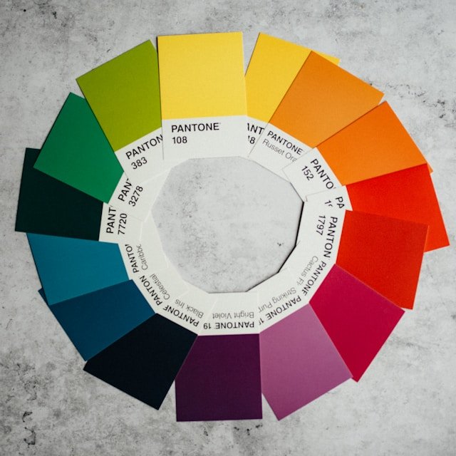
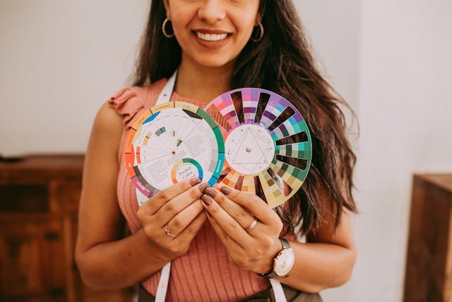
The color wheel is a circular diagram showcasing the relationship between colors. It consists of three primary colors: red, blue, and yellow, which are fundamental and cannot be created by mixing other colors. When you combine two primary colors, you get three secondary colors: green (from blue and yellow), orange (from red and yellow), and purple (from red and blue).
Tertiary colors are the result of combining a primary color with a neighboring secondary color. For instance, red-orange or blue-green. The color wheel illustrates how these colors interact and can be harmoniously combined, forming the basis for color theory in various fields, such as art, design, and fashion. Understanding these relationships helps create visually appealing compositions and aesthetics.

Identify Your Base Color
Start by choosing a base color for your outfit. This foundational hue can either be a personal favorite or a classic neutral such as black, white, or gray. The base color serves as the anchor, setting the tone for the rest of your ensemble. It provides a cohesive starting point and influences subsequent choices for complementary or contrasting shades, allowing you to build a well-coordinated and visually appealing outfit. Consider the occasion, your style, and the mood you want to convey when selecting the base color, ensuring it aligns with the overall aesthetic you wish to achieve.
Choose a Color Scheme
When choosing a color scheme to style clothes, consider various relationships on the color wheel. Here are some common schemes explained in detail:
Analogous: This scheme involves selecting colors that are next to each other on the color wheel. For example, if your base color is blue, you might complement it with shades of green or purple.
Complementary: Choose colors that are opposite each other on the color wheel. This creates a high-contrast and vibrant look. For instance, pairing red with green or blue with orange.
Monochromatic: This scheme involves using different shades and tones of a single color. It provides a sophisticated and cohesive appearance. For instance, combining light and dark shades of blue.
Triadic: Select three colors that are evenly spaced around the color wheel. This creates a balanced and harmonious look. For example, choosing red, blue, and yellow.
Split-Complementary: This scheme involves selecting a base color and then using the two colors adjacent to its complementary color. For instance, if your base color is red, you might use yellow-green and blue-green as complementary colors.
Consider the mood, occasion, and style when choosing a color scheme. Experiment with different combinations to find what works best for the look you want to achieve, ensuring a visually pleasing and well-coordinated outfit.

Balance Warm and Cool Tones
Pay attention to the warmth or coolness of the colors you choose. Warm tones (reds, oranges, yellows) and cool tones (blues, greens, purples) can be balanced for a visually pleasing effect.
Consider Neutrals
Integrate neutral colors (black, white, gray, beige) to provide balance and prevent the outfit from becoming overwhelming. Neutrals work well with almost any color scheme.
Let’s say you have a warm-toned mustard-yellow blouse. You can balance it with cool-toned jeans or a skirt in a shade of blue or gray. To further enhance the balance, you might add a neutral element, like a white cardigan. Accessorize with silver jewelry (cool-toned) to complement the outfit.
Remember, the key is not necessarily to have an equal amount of warm and cool tones, but rather to create a visually pleasing composition where the tones complement each other.

Think about Proportions
When considering proportions in your outfit, it’s essential to think about the balance of each color. For instance, if you opt for a bold color, it’s advisable to complement it with more subdued tones or neutrals to achieve a harmonious look. Additionally, when deciding on dominant and accent colors, choose whether warm or cool tones will take the lead. The dominant color serves as the primary hue, while the accent color complements and balances it. For example, if your outfit features warm tones like red and orange, introducing a cool-toned accessory, such as a blue scarf, can create a pleasing contrast.
Or you may Adhere to the 60-30-10 rule. This classic design principle suggests allocating 60% of your outfit to the dominant color, 30% to a secondary color, and 10% to an accent color. This approach fosters a visually balanced and cohesive appearance. For instance, in an ensemble where warm red dominates, incorporating cool navy blue as the secondary color, and accessorizing with a small item in a cool green shade, adheres to this proportion and enhances the overall aesthetic appeal.
Experiment with Patterns
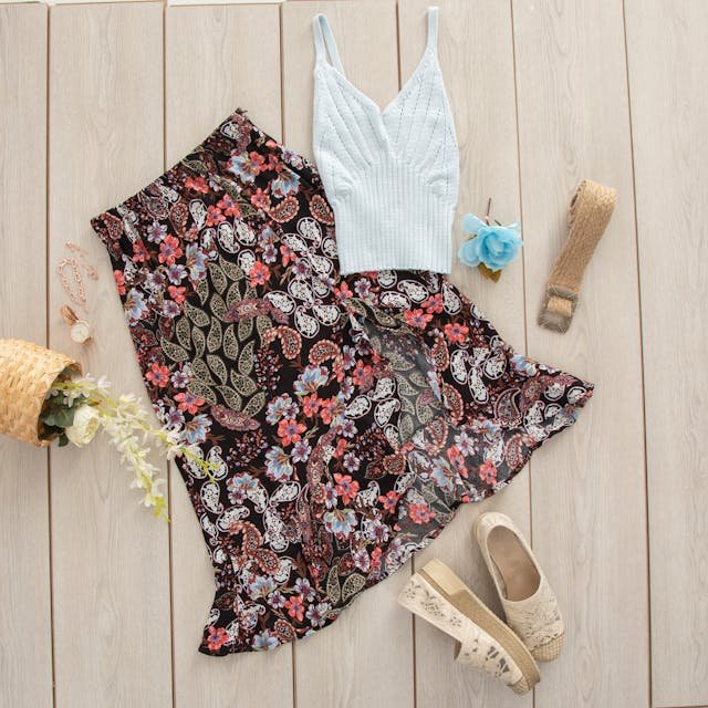
When experimenting with patterns while using the color wheel for styling clothes, it’s important to ensure that the colors within the patterns align with your chosen color scheme. Patterns can be a great way to add visual interest to your outfit, but for a cohesive look, the colors within the patterns must complement the overall color harmony you’ve established. Consider incorporating patterns that include shades from your chosen warm or cool color palette. For example, if your outfit is predominantly warm-toned, opt for patterns that feature complementary warm colors. Similarly, if your ensemble leans towards cool tones, choose patterns with cool-colored elements. This approach helps maintain a sense of balance and unity in your overall look, ensuring that the patterns enhance rather than clash with your chosen color scheme.
Accessorize Thoughtfully
When using the color wheel to finalize the style of your clothes, it’s crucial to accessorize thoughtfully. Pay close attention to accessories such as shoes, bags, and jewelry, as they can play a significant role in enhancing or contrasting with the chosen colors. For instance, if your outfit primarily consists of warm tones like reds and oranges, consider accessorizing with items that either complement these warm hues or provide a contrasting cool tone. A thoughtful approach might involve pairing warm-toned clothes with accessories in a complementary cool color, like a blue handbag or green earrings. Conversely, if your ensemble is cool-toned, opt for accessories that either align with those cool tones or add a pop of warmth for visual interest. This attention to accessory colors ensures a cohesive and well-coordinated overall look, allowing accessories to serve as accent pieces that contribute to the overall style and color harmony of your outfit.

Consider the Occasion
When finalizing your outfit using the color wheel, it’s essential to carefully consider the occasion or context in which you’ll be wearing it. Different color combinations evoke distinct vibes and may be more suitable for specific settings. For example, vibrant and bold colors might be ideal for casual wear, creating a lively and playful look. On the other hand, muted or neutral tones often work well for formal or professional settings, conveying a sense of sophistication and professionalism.
Understanding the appropriateness of color choices for different occasions ensures that your outfit aligns with the environment and sets the right tone. For casual outings, you might feel more inclined to experiment with vibrant contrasts or eclectic combinations, while formal events may call for a more restrained and elegant color palette.
Trust your Instincts
Despite guidelines, personal style remains paramount. Trusting your instincts allows you to infuse your unique taste into your outfit choices. Experiment with different color combinations, taking into account your preferences, mood, and the overall aesthetic you want to achieve. Your instincts often guide you towards combinations that resonate with your personality and make you feel confident.
Note: Remember that styling with the color wheel is a guideline, and there are no strict rules. Feel free to get creative and express your unique style while keeping the basic principles of color harmony in mind.
